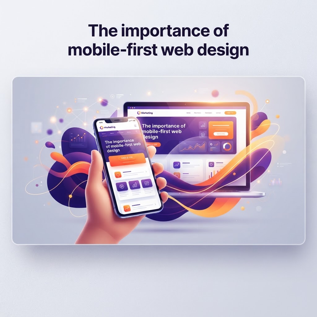
Why Mobile-First Design is Non-Negotiable for Your Baltimore Business
In today’s digital landscape, mobile-first design isn't just a luxury; it is a critical requirement for search engine success and user engagement. Learn why your website needs to prioritize mobile users to stay competitive in the Maryland market.
The Shift Toward a Mobile-Centric World
In the bustling business corridors of Baltimore, from the Inner Harbor to the creative hubs of Station North, the way customers interact with brands has fundamentally shifted. Gone are the days when users sat at desks to browse the web. Today, the vast majority of search queries and consumer interactions happen on the go, whether your customer is waiting for the light rail or grabbing a coffee in Fells Point. As a veteran-owned agency, Charm City Interactive understands that mission readiness is about adapting to the terrain, and the current digital terrain is undeniably mobile.
What is Mobile-First Design?
Mobile-first design is a strategic approach where the design process begins with the smallest screen size and progressively scales up to larger displays. Instead of shrinking a desktop site to fit a smartphone, we start with the core functionalities, critical content, and essential touchpoints that a user needs on their phone. This ensures that the user experience is fluid, fast, and focused from the very first pixel.
Why Mobile-First Matters for SEO
Google has been utilizing mobile-first indexing for years, meaning it primarily uses the mobile version of a website for indexing and ranking. If your site is cumbersome, slow, or poorly structured on a mobile device, your search rankings will suffer, regardless of how great your desktop site looks. For local Maryland businesses, this means losing ground to competitors who have invested in responsive, mobile-optimized platforms. By focusing on mobile, you are telling search engines that you provide a superior experience to the modern consumer, which directly correlates to higher visibility.
Key Benefits for Your Brand
- Improved Load Times: Mobile-first design forces lean code and optimized imagery, which are critical for users on 4G or 5G networks.
- Better User Engagement: When navigation is intuitive for thumbs, users stay longer, browse more pages, and are more likely to convert.
- Consistent Branding: A mobile-first approach ensures that your core message remains front and center, regardless of the device.
Actionable Tips for Mobile Optimization
If you are looking to refresh your web presence, start with these actionable strategies to ensure your site is built for the mobile-first era:
1. Simplify Your Navigation
Mobile screens don't have room for massive, complex menus. Use a clean 'hamburger' menu or focus on the three most important actions a customer needs to take—such as 'Call Now,' 'Get Directions,' or 'Contact Us.' By reducing clutter, you guide the user directly to the conversion point.
2. Optimize for Touch Targets
Have you ever tried to click a tiny link with a thumb and hit the wrong button instead? It is a frustrating experience that leads to high bounce rates. Ensure all buttons and links have enough padding and are sized appropriately for touch interactions. In a local context, this is vital for businesses like restaurants or service providers where a user might be trying to make a quick reservation or booking while in transit.
3. Prioritize Speed Over Flair
Animations and high-resolution videos are great, but not at the expense of load time. Compress your images, minify your CSS/JavaScript, and use lazy loading. A site that takes more than three seconds to load will lose nearly half of its visitors. Keep it snappy to keep your audience engaged.
4. Use Readable Typography
Avoid tiny fonts that require the user to pinch and zoom to read. Stick to standard, legible font sizes (at least 16px for body text) and ensure there is plenty of contrast. Your content should be readable at a glance, especially for users catching up on local news or events in the Baltimore area.
The Bottom Line
As a business owner, your website is your 24/7 storefront. In a competitive market like Maryland, you cannot afford to alienate mobile users. By adopting a mobile-first philosophy, you ensure that every visitor, whether they are a local Baltimorean or a visitor from out of town, has an seamless experience. At Charm City Interactive, we believe in building digital foundations that stand the test of time. Is your website ready to meet your customers where they are? If not, it is time to shift your strategy to mobile-first.
Ready to Grow Your Business?
Schedule a free strategy call with the Charm City Interactive team.
Book a Free Call →