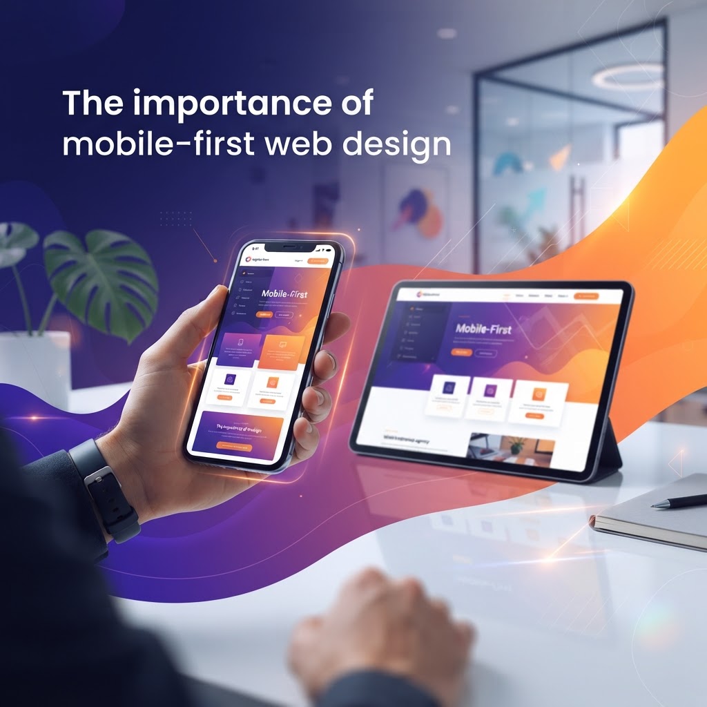
Why Mobile-First Design is Non-Negotiable for Baltimore Businesses
In today’s digital landscape, your website must shine on smartphones before anything else. Discover why a mobile-first approach is the key to outranking competitors and converting local Maryland customers.
The Shift Toward Mobile-Centric Browsing
As a veteran-owned agency here in Baltimore, we have seen the digital landscape evolve rapidly. If your website was built for desktop computers first and merely adjusted for phones as an afterthought, you are losing valuable traffic. Mobile-first design is no longer just a trend; it is the fundamental standard for modern web development. Because Google now uses mobile-first indexing, the search engine evaluates your site based primarily on its mobile version. If your mobile experience is lackluster, your SEO rankings will suffer, regardless of how beautiful your desktop site looks.
What Exactly is Mobile-First Design?
Mobile-first design is a strategy where designers start with the smallest screen size—smartphones—and build outward to tablets and desktops. This approach forces you to strip away the clutter, focusing solely on the core content that actually helps a user achieve their goal. By prioritizing the essentials, you naturally improve site speed, readability, and user engagement, which are the primary pillars of a high-converting website.
The Impact on Local SEO in Maryland
For businesses serving the Maryland region, local SEO is a lifeblood. When a potential customer in Fells Point or Canton searches for services on their phone while on the go, they want immediate results. If your site takes too long to load or requires pinching and zooming, they will hit the 'back' button instantly to find a competitor. A seamless mobile experience is directly tied to lower bounce rates and higher dwell times, two metrics that signal to Google that your business is a trusted authority in the Baltimore area.
Actionable Tips to Optimize Your Mobile Presence
Optimizing for mobile is not just about responsiveness; it is about performance and user experience. Here are a few ways to get started:
- Prioritize Page Speed: Mobile users are impatient. Use tools like Google PageSpeed Insights to identify and compress large images, minimize CSS, and reduce server response times.
- Simplify Navigation: Ditch the complex drop-down menus. Implement a clean 'hamburger' menu that provides easy access to your services, contact page, and current offers.
- Optimize for Touch: Ensure your buttons and call-to-action (CTA) links are large enough to be easily tapped with a thumb. Avoid placing links too close together to prevent accidental clicks.
- Leverage Local SEO: Ensure your NAP (Name, Address, Phone) information is prominent on every mobile page. Integrating a 'Click to Call' button can significantly increase conversions for local service-based businesses.
Content Strategy for Smaller Screens
When you have limited screen real estate, your content needs to be punchy and purposeful. Avoid walls of text that look endless on a smartphone. Instead, break your content into short, scannable paragraphs and utilize bulleted lists—just like this one. Use headers to guide the user’s eye and ensure that your primary CTA is always 'above the fold.' Whether you want users to book an appointment or browse your product catalog, that action should be visible the moment they land on your page without requiring them to scroll through fluff.
The Role of Accessibility
A true mobile-first strategy also considers accessibility. In Baltimore’s diverse and inclusive community, it is essential that your website is usable by everyone. This means maintaining high color contrast ratios, using descriptive alt text for all images, and ensuring that screen readers can effectively interpret your site’s layout. When your site is accessible and mobile-friendly, you widen your potential customer base significantly.
Partnering for Growth
At Charm City Interactive, we believe that your website should work as hard as you do. Mobile-first design is about respect—respect for the user's time and respect for the device they carry with them every day. By making these changes now, you are positioning your brand to thrive in a mobile-driven economy. If you are ready to audit your current digital presence or start a fresh, mobile-optimized build, our team is here to help you navigate the process. Let’s make sure your Baltimore business stands out on every screen, from the harbor to the suburbs.
Ready to Grow Your Business?
Schedule a free strategy call with the Charm City Interactive team.
Book a Free Call →